Shade Tree Mechanics

Life imitates art.

On a recent adventure to a pottery festival, I saw this beautiful 1953 Chevrolet truck.  It was a glorious blue, beautifully restored, and photogenic from all angles.  But my favorite angle was this one because it mimicked the truck I put on a quilt a few years ago.


In 2015, when pondering a design for a raffle quilt for my husband’s local Vintage Chevrolet Club chapter, I decided to create a scene where men might tinker on their machines. I love including trees on quilts, so the title was easy 

The quilt measures 44” x 70“ and is a combination of needleturn appliqué, raw-edge appliqué, hand-guided freemotion quilting, trapunto, and printing on fabric.

I drew the design on acetate transparency and using my vintage overhead projector, enlarged the image to fill the background fabric pinned to my design wall.  The same technique was used to draw the freezer paper templates for the tree trunks and the various pieces of the truck.  I used commercial fabric to build the images, working from background to foreground as I attached the pieces.


I posted these photos to Facebook as I worked and it triggered many memories my students in math classrooms in days gone by.


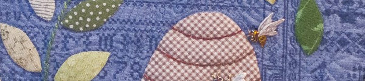
The quilt top on the design wall before quilting began.


Wool batting was layered underneath the Chevrolet emblem on the tailgate, stitched down with water soluble thread.  Then the excess batting was cut away before layering the entire top on a cotton batting.

Freemotion stitching made the layers become one, a quilt.  In addition, that stitching was used to differentiate areas of the dashboard, windshield, and tire tracks on the ground.  Freemotion stitching was used to attach the raw-edged leaves as well. 

A photo of an antique car tag was scaled to fit the license plate space and printed onto fabric.  Blue was chosen for the 1953 model truck because there is such a truck in Jim’s family.  And blue…well, it’s blue.

A bowtie-shaped Chevrolet icon served as the basis for the handwritten label.  Sadly, I don’t seem to have a photo of that.

Note:  One purpose in writing this blog is to record details of quilts I’ve made.  I had written most of these details in a draft a couple of years ago, but the photo of a real truck like the one I fabricated spurred the post to publication.  As I read the details I had written, I was reminded how important it is to write things down.  I had forgotten the details of the wool batting layer, raw edged leaves, and thread choices.  

Especially since the quilt is no longer in my possession, the written description of the process is more valuable in case I want to do something similar again.

Another note: Many of these photos were made with an older iPhone and poor lighting conditions.  Reducing them to post online makes for even poorer quality, but clicking on the image to enlarge it may reveal some details you miss in the original.

Blue and White and Red

Quick, answer this question:  “What is Sandy’s favorite color?” 

That line brought a big chuckle when I recently asked it at a presentation I was giving.

It’s a little obvious when my work is collected together.


But sometimes I like to add a bit of red and white to the blue, as I did in this piece that’s next on my list of “ready to quilt.”  

I’ve mentioned before that I like to work seasonally.  So a small project I made this year as July 4 approached was this one called Stars in Bloom.  The pattern came from Blackbird Designs, and I interpreted it in cotton and wool. 

The rich red flower petals are various reds from my wool stash, the most prominent being from that red cashmere coat I bought a few years ago.  The vines and leaves and blue stars are cotton fabrics.


I certainly want the quilt label to be unique.  It’s important to include a label identifying the quilt title, the maker, the date.  A simple rectangular piece of cloth containing this information is better than nothing, but since I began quiltmaking, I’ve enjoyed including elements of the quilt’s design in the label.

Ollie Jane’s Flower Garden has a lily similar to the one on the front of the quilt as its label.  Walker’s Pasture has a miniature photo of the front of the quilt on the label.  Mom and Apple Pie’s label features a flag (an appliqué element from the front – and the label you see at the right).

That said, I may have gone a bit overboard in this small piece.  The combination of hearts and stars on the front led me to include a heart and a star.  It took a big star (well, big relevant to the size of the quilt) to contain the title and my name.  Then an even bigger heart was needed to surround the star. Above, the view of the backside.  Do you think the label is visible?

As has become my custom, I embraced the raw edge on this label.  The star was machine stitched to the heart, then the heart was attached using the “glue stitch” I learned from Jude Hill, hand stitching the label through the quilt back and batting.  As time goes on, the raw edges will fray more, adding to the charm of the back.  Or to the tattered look, depending on your perspective.

More about Stars in Bloom:  This piece finishes at 12” x 17”.  The appliqué is a combination of wool and cotton.  The cotton pieces are hand stitched needle-turn appliqué.  Some hearts are made of felted wool and stitched down with a whip stitch, again by hand.  The quilting is free-motion machine stitching (incorporating some hearts in the design) using silk thread on top and cotton thread in the bobbin.

Backsides


I like backsides.  When I’m doing street photography, I often focus on images of people from the rear.  Maybe that’s because I think the result is more likely to convey a universal truth than if the face is there; identifying the individual as, well, an individual.


With quilts, too, I like the backsides to be interesting compositions.  The expected traditional way to back a quilt is to use yardage of one fabric.  I admit I do that sometimes.  But most often when I do that, I find the result to be boring to me.

I often piece the backs of my quilts, especially the large ones.  The blue “wonky star” above is on the back of GBI Blues.  I included lots of my favorite blue fabrics that hadn’t found a home on the front.  In 70 and Still Wearing Jeans, I used pieces of fabrics collected for Jim’s quilt where the images were too large to include in the stars on the front.

In Seven Black Birds, I incorporated the discarded half-square triangles created for the sashing in the back.  That quilt hangs on a ladder in the den and more often than not, the “back” side is what is turned out to the viewer.  That’s the quilt here on the hayrack and bicycle.

Sometimes I have fabric that I don’t want to cut up into little pieces for use on the front of the quilt, so I use a whole piece of it as the back of something.  That way I can leave the piece as a whole unit. The toile piece in the photo above is on the back of Blue Tumbling Blocks, a small wall hanging described here.   I recently wrote about Linen Baskets in which I did the same thing with a fabulous Jane Sassaman print.

My most recent piecing effort was inspired by a piece of fabric I’ve had in my stash for many years.  I just didn’t want to cut it up.  So a pattern involving books (paper foundation pieced) seemed perfect for the front of a quilt with the “reading” fabric on the back.  So, it’s true.  I designed a quilt with the back planned first.  Here is a photo of the backing fabric folded on top of the pieced top.  More details and photos will follow when the quilting is done.

A Lily for Ruth


Ruth loved gardening.  She loved the feel of the brown earth between her fingers as she planted bulbs and seedlings, anticipating the color that would come later.  She reveled in a pleasant day with white clouds in a blue sky.

At least that’s how I imagine the Ruth whose family had this lily engraved on her headstone.


To remember Ruth forever, I made a crayon rubbing of the lily on silk fabric and added dimension and detail with free motion machine stitching.  I added some lace and beads with  hand stitching and layered it all atop an old quilt remnant.  

I hope Ruth would be pleased.


Jim and I enjoy exploring cemeteries.  Sometimes those walks end up in artwork.  Earlier references to other adventures are here and here and here.

Linen Baskets

We headed out the door on a “Saturday ride-about”, bringing cameras and a quilt.  This depot was abandoned at the moment, so we posed the quilt and snapped a few shutters.  

This little quilt, Linen Baskets, is a sample I made a couple of years ago when my favorite quilt shop had a fat quarter bundle of linen fabrics.  The polka dots are all linen, the white background is a Kona cotton solid.  Finished, it measures 35” x 43”, a nice size to drape over a chair or hang on the wall. 

I love the little baskets.  They are adapted from a pattern called Big Bloomers from QuiltSoup.  I added wool appliqué in the border with some beading and embellishments.


We live near Zebulon Road, but it doesn’t lead to the town of Zebulon.  That fact amuses us.  We have noticed many Zebulon Roads in the middle GA area which, when studying a map, do not lead to Zebulon either.  So for this little quilt to get to pose on benches and doors and roof brackets of the depot in Zebulon was a fun note to add to our day. 

The quilting is a quick loopy meandering trail done with cotton thread and using thin cotton batting.  The backing is a bright fun Jane Sassaman design.  Many people like basket quilts as much as I do, but when I take this to groups, there are always gasps of delight when they see the back of this one.


I liked the contrast of the soft quilt with the hard lines of the doors and the weathered wood of the floor boards.  Jim did some of his darkroom magic on some of his shots, intermingling color and black and white.  I never get tired of that!