Remember the really pretty tatting I dipped in the walnut dye? I wanted it darker, began doing some research and learned about iron water. We have plenty of rusty nails around here, so soaking them in a jar with vinegar and water was not a complicated process.
I had attempted some rust dyeing in the past with less than spectacular results. But I hadn’t mixed iron water with the walnut dyed fabric.
Below are images from baths in the iron water only, and some things dyed in walnut dye, then iron water.
Before: this is a bit of linen sheet and some old tatting previously dyed in indigo, some old tatting not yet dyed.
After: those same pieces after a bath in iron water only…no walnut on these pieces.
It’s always a delight to see how different threads take the dye differently. The monogram on this linen towel is stitched with cotton thread. The linen towel was only in the walnut dye, the tatting was in walnut dye, then iron water.
Here are the two sides of a bit of a damask tablecloth. These were soaked in the walnut dye a few days, then dipped in the iron water.
This linen towel shows how powerful the iron water is combined with walnut. This whole piece was not in the iron bath, just the walnut…but the residue on my gloves made these splotches. I find the spots interesting, not offensive.
The top doily here was dyed with walnuts, then composted. It was unintentional composting…as I was rinsing these new pieces, I discovered the doily in the leaves – left there from the earlier walnut dyeing day.
I am very pleased with the results of this combo…soaking in the walnut dye, then dipping in the iron water. Lesson learned: make more iron water. I had experimented with a small quantity, so only small pieces resulted from this trial. But more, more, more, to come….
This is the featured photo on the website, but for those who just read the email version, you would miss this….I always think I need to mix browns with blue, you know….but maybe some with green, too.
The recent blog post on walnut dyeing is here…if you missed it or want to refresh your memory on the before and after images from only a walnut bath.
One of the things I do in the fall is collect acorns. Every year I find myself coming home with a few perfect specimens after every day’s walk. I add them to this bowl…eventually it is filled and I admire it through the winter. In the spring, I throw them out. In the fall, I begin again.
I don’t know exactly what the fascination is with acorns. I grew up with pecan trees. I gathered plenty of those in my childhood. That was the source of my Christmas money every year. Oaks and acorns came later in my life….
I’m still collecting acorns this year…but my latest fascination is with walnuts.
A few years ago, I attended a Folk Life Festival at a historic site in Tifton, GA. Among the many delights there was a woman using walnut and indigo dyes to make the most beautiful yarn. I was captivated. From her I learned that walnut doesn’t need a mordant; that you collect the walnuts while in the green hulls; that they must ferment first, then be boiled before you can dye with them.
I followed those instructions and dipped a few things, but it was a lot of trouble.
I’ve experimented with brown commercial dyes before (that post is here) but the walnut gives a more pleasing color to me. I love the surprise of the varying richness based on the fabrics I use and the time it soaks.
This year, I gathered some black walnuts in their husks, put them in a bucket of water, covered it, and began the fermenting process. After a couple of days, I thought, “I wonder what would happen if I dipped a piece of fabric in there as they fermented.” A friend had brought me a pretty white cotton napkin and I submerged it among the walnuts. In a few days, I had a nice bit of brown fabric.
I found another napkin, damask this time, and some laces…added those to the bucket for a few days. Look at how gorgeous these are!
I had a few pieces of vintage linen that I wanted to see what happened. So I cut a few pieces of those, added a worn white cotton tea towel, and a skein of white embroidery floss. I left these just a couple of days…not wanting to completely obscure the checked pattern in the linens. Oh, my, I’m loving this!
The images above are before and after of dipped fabrics.
And of course you aren’t surprised that I photographed some of the browns with some blues. Earlier confessions of my love for this color combination are here and here. And, if that’s not enough, type “brown” in the search bar…there are more!
Now in the pot are a few more treasures. I don’t remember exactly what I put in there, but do know that some old pink rickrack is getting new life. Stay tuned.
And there are a lot of hickory nuts around here, too. Hmmmm….
As I wrote this and revisited the photos from the Folk Life Festival, I guess that’s what encouraged me to play with indigo dyes, too. There’s a whole category in the sidebar for that!
Ya’ll know I love brown. My grandmother’s tea leaf pattern china with its brown and white scheme, all kinds of treenware (usually a shade of brown), and vintage linens (often with a bit of brown stain somewhere) bring brown into view everyday. Oh, and my brown cows stroll around in the breakfast room.
I like brown plants, too. I see beauty in the fading stage of a flower’s life as well as in the emerging beauty seen in spring. So this time of year brings even more brown into my camera lens.
Some recent photos celebrate the fading stage. Enjoy some brown!
This hummingbird doesn’t mind that its perch is drooping and brown. He can still rest quite comfortably here.
This withering zinnia is the same color combination as Granny’s china and my creamer cows.
A Pearl Crescent finds something to like on this even more withered zinnia.
This praying mantis caught a ride on the “trash can to the street journey” one day and I brought him home to the porch.
Pink is never my favorite color, but the withering pink here captured my attention.
This red zinnia is aging (aren’t we all?) but look at the color scheme revealed! I see French General red fabrics with their companion browns and grays.
My sewing basket has a brown collection in it, too. A long-term project at hand right now is one with brown irregular hexagons. I’m hand piecing them with a modified English Paper Piecing process…I remove the paper before stitching them together.
Some plants in my yard are confused. As I write this and share the glories of withering plants, I have three fresh-from-the-earth Queen Anne’s Lace plants scattered in the garden. One is blooming delightfully now; others are ready to bloom. It’s like they are reminding me that “green is beautiful, too.” Yes, it is!
I’ve written about the beauty of brown before. Type “brown” in the search box in the sidebar and you’ll find more.
Their first date was at a church gathering for an all-day-sing.
They grew up in the same county, attended the same high school, but it was a long commute between their homes. Twelve miles represented a fortune in time and money – in the early 1930’s, times were tough.
So they wrote to each other. And one heard about a sing that was going to be at High Hill Church, in a far corner of the county – some ten more miles from each of their homes. But families took Sundays off and went to such gatherings. They planned to meet up at the sing, and the courtship became official.
They married a couple of years after that sing and went on to live and prosper in that same county…the “til’ death” part lasted 52 years, all spent in Turner County. Prosperity didn’t come quickly – there were hard times on the farm – but happiness and contentment flourished. My sister and I benefited from two loving parents.
This art quilt I call First Date tells a story of their lives in Turner County and includes evidence of many memories.
I found a map of Turner County printed in the 1930’s in an antique store and transferred it to fabric. The colors in it and in the photos of my parents from that era dictated the whole piece. (And ya’ll know I lean toward browns….)
I made a legend for the map depicting the church where they had their first date with a heart shaped button. Other beads and french knots show the location of their homes and church home.
I included do-dads from a milliner’s supplies (my mother was one of the last to give up the habit of wearing a hat to church), bits of tatting, lace, buttons.
There are remnants of one of Daddy’s suits, a bit of lace from one of Mama’s dresses.
A fabric flower is made from barkcloth much like the living room drapes we had when I was a child.
I made this and mounted it on canvas several months ago. I haven’t shared it before because I’m not quite happy with it on the canvas…I keep looking at it, wondering if it’s best that way. I may add a frame or may remove it from the canvas and finish it more like a quilt. But …here it is, as it is.
Update…since writing this post, I found a couple of relevant photos..
A photo of my parents shortly after their marriage in 1935.A photo of High Hill Church made in the 1930’s shows how the church would have looked on the occasion of that first date. It also reveals how appropriate the name is. In the flat terrain of Turner County (average elevation 407 feet), High Hill sits at a dizzying 420 feet above sea level.
I love blues and browns and I especially love them together!
Mother Nature loves blues that go to brown, too. Look at this hydragangea in different stages of its blooming life this summer. The final brown bloom hanging on is just as beautiful to me as the most cobalt of blues!
I recently made a slow stitched study in blues and browns.
It started when I made this notebook cover as a gift. The colors were so rich and entrancing that I wanted to use the leftover bits in another project.
The linen background came from some yardage a friend brought to our quilt guild from her mother’s stash. The mother was downsizing and moving – we benefited from the clean out!
The bits of blues and neutrals were from my collection of old and new bits of fabric and lace.
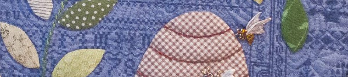
The hexagons led to a bee theme of sorts.
I experimented with various weights and colors of thread, added beads and buttons.
This format, the rolled up collage, is a favorite of mine. I used a thin layer of batting under the brown linen while doing all the stiching. For a backing to cover the messy seed stitching, I added a bit of an indigo overdyed linen sheet. I attached this with a tiny seed stitch with a fine thread; going only through the layer of blue and the batting.
In our household, we often quote favorite movie lines to convey a big message in a few words.A bit like a secret language, the power of a select phrase can convey a sense of place, a mood, or a personality, and add to the bond of family.
One phrase that’s part of our oft-repeated mantras is “remember me?” spoken in the tone Julia Roberts used in Pretty Woman.You know the scene when she returns to the uppity sales clerk who had refused to help her. Laden with packages from another Rodeo Drive shop, she twirls about and smugly displays her loot.There’s a follow-up line about working on commission and “Big Mistake.”We quote that sometimes, too.
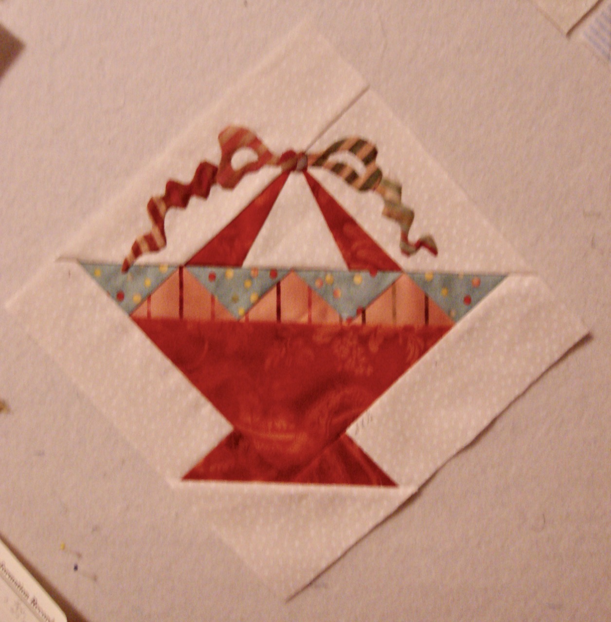
Several years ago, when I was a member of a mini-group of quilters who called ourselves The Basket Cases, we exchanged blocks to make quilts.The rules were: make a 9” basket for each other member of the group, in the color specified by each gal; then make your own quilt with the result.I chose blue (big surprise), as did Mary.Susan asked for red and pink.Dale requested pastels, and Angie’s color was terra cotta.
The single basket block you see here is from one set of blocks I made to exchange.The others I made for them were similar, but with pieced bows at the top, not appliquéd bows like these.I made some of that type in blue for myself, too.
We made the exchange baskets twice and each assembled her own quilt using whatever setting was desired. I had eight baskets from friends (you can find four pairs of similar baskets in my quilt, each pair from one quilting sister) and four I had made.
I struggled with the various shades of blue and the different levels of contrast until I remembered how I love brown with blue.This dark brown polka dot seemed to be the perfect fabric to enclose the group of baskets and serve as a border.
I tried the polka dot as alternate blocks, but the big blocks of color were distracting.So back to the sewing machine.I made six 7” basket blocks, framed them with 1” borders of the brown which acted as sashing, and was done.
So it was time for a title.The brown polka dots reminded me of a dress Julia Roberts wore at the polo match in Pretty Woman.So, Remember Me was the perfect phrase to convey the movie connection and the spirit of the exchange blocks with the Basket Cases.
The photos of the quilt were made on an outing to Auchumpkee Creek.Jim made some photos, I made others.
In this photo, you see the back of the quilt with a tree’s shadow on it.As I often do, I pieced the backing with several blue fabrics.
I did not do the quilting on this one.My friend and longarm expert, Kathy Darley, did a great job putting the layers together.
Kits to make quilts are wonderful. They are a great way to make a quilt if you don’t have a large fabric stash, if you aren’t comfortable selecting fabrics, or if you just want to jump right in with a ready supply of coordinated fabrics in the right colors. A good friend advises that they are great for travel or retreat projects, because they are packaged ready to sew on the go.
Hartwell Commons was made from a kit. I ordered the block-of-the-month kit early in my quilting career, I suppose it was in 2002 or so. When the first package arrived, the schoolhouse block, I opened it ready to jump right in.
Instructions were given for two techniques; paper foundation piecing, and appliqué. I did not know either one. So I bundled it all back up and put it back in its big ziploc bag. It waited month by month as its companions arrived in the mail and the charges were added to my credit card bill. I paid the bill knowing that maybe someday I would have the skills to make the quilt.
My friend’s advice came to light a couple of years down the road when we were preparing for a girls’ getaway to a friends’ lake house. I was lamenting that I didn’t know what project to take, and Dale said, “do you have a kit?”
Why, yes, as a matter of fact, I did. I grabbed the first couple of month’s packages, some substitute fabrics (I had already realized that using someone else’s idea of fabric combinations was not my way of working) and off we went to Lake Hartwell.
By then, I had learned both techniques of paper foundation piecing and needleturn appliqué. I love to do handwork and don’t like to travel with my sewing machine, so appliqué was the approach I used.
Once started, I quickly finished all the houses, but uh-oh, I didn’t know all the embroidery stitches and had never worked with silk ribbon. So the blocks sat again waiting. The next retreat with the same group of gals to the same place meant the embellishment phase could begin.
The embroidery was done, blocks were assembled by machine, and I was ready to do the quilting. I referred to Leah Day’s 365 Free Motion Quilting Designs website for ideas and video instructions on filler designs for the background. All the varied filler designs are still favorites of mine, and I often run downstairs to look at this quilt on the wall when I need ideas on another project.
Quilt details: Finished size is 85” x 88”. The pattern is called The Quilted Village by the City Stitcher. Cotton fabrics, silk thread embroidery. Completed 2010. Cotton batting. Quilting thread DMC machine embroidery thread, two-ply, 50 weight cotton. Free motion quilted on home machine. Since there are lots of goat farms around Lake Hartwell, I made the label in the shape of a goat.
Brown is a new favorite color of mine. Blue has always been at the top of the list for me, but in recent years, I’ve come to love brown. Maybe there is a reason.
This photo is one I made a few years ago to use on the invitations to my family reunion. Pictured are a platter and pitcher from the Tea Leaf dinnerware which was my grandmother’s pattern. On the evening of Ollie Jane’s wedding in 1890, her mother hosted a supper for family. She served the meal on those dishes and gave them as a gift to the bride and groom. These two pieces in the photo were later purchases, but I do have one plate left that was on Ollie Jane’s table that night. The large pitcher was one she used and I still use it, too.
Also in the photo is a piece of brown and white checked fabric. I’ve been accused of “adding a little brown check” when a quilt needs a spark of something different (as in GBI Blues), or when I don’t know what else to use (as in Seven Black Birds). [Photos of those two quilts are in the gallery.] I included that fabric in this photo because it looks like the apron I remember Ollie Jane wearing a lot during the last years of her life.
When I printed the photo of Bunk Bates for the Flag Bearer quilt I wrote about yesterday, I printed the above photo on linen as well. In thinking about a composition using that photograph, I decided to pour some dye in a bucket and dip some things. Here you see them drying.
Stay tuned for the final result, but suffice it to say, I’m having a lot of fun! I ordered some indigo dye today; I can’t wait to play with that. Oh, I like blue and brown together, too.
You can read more about Ollie Jane’s wedding and her quilts here. And more about her influence on my quiltmaking here.


 Kits to make quilts are wonderful. They are a great way to make a quilt if you don’t have a large fabric stash, if you aren’t comfortable selecting fabrics, or if you just want to jump right in with a ready supply of coordinated fabrics in the right colors. A good friend advises that they are great for travel or retreat projects, because they are packaged ready to sew on the go.
 By then, I had learned both techniques of paper foundation piecing and needleturn appliqué. I love to do handwork and don’t like to travel with my sewing machine, so appliqué was the approach I used.
 Quilt details: Finished size is 85” x 88”. The pattern is called The Quilted Village by the City Stitcher. Cotton fabrics, silk thread embroidery. Completed 2010. Cotton batting. Quilting thread DMC machine embroidery thread, two-ply, 50 weight cotton. Free motion quilted on home machine. Since there are lots of goat farms around Lake Hartwell, I made the label in the shape of a goat.
 This photo is one I made a few years ago to use on the invitations to my family reunion. Pictured are a platter and pitcher from the Tea Leaf dinnerware which was my grandmother’s pattern. On the evening of Ollie Jane’s wedding in 1890, her mother hosted a supper for family. She served the meal on those dishes and gave them as a gift to the bride and groom. These two pieces in the photo were later purchases, but I do have one plate left that was on Ollie Jane’s table that night. The large pitcher was one she used and I still use it, too.